The Company
Property Management Software is a growing industry as an outdated industry begins to move into the modern age. The client prides themselves on being the best communication and management platform in the industry for medium to large scale management companies and requested print designs.
We may be in the age of digital media, but that doesn’t mean print media is dead. There are still a variety of materials companies require in their day to day work. This includes flyers, letterheads, and trade show banners.
Trade Show Materials
Folders
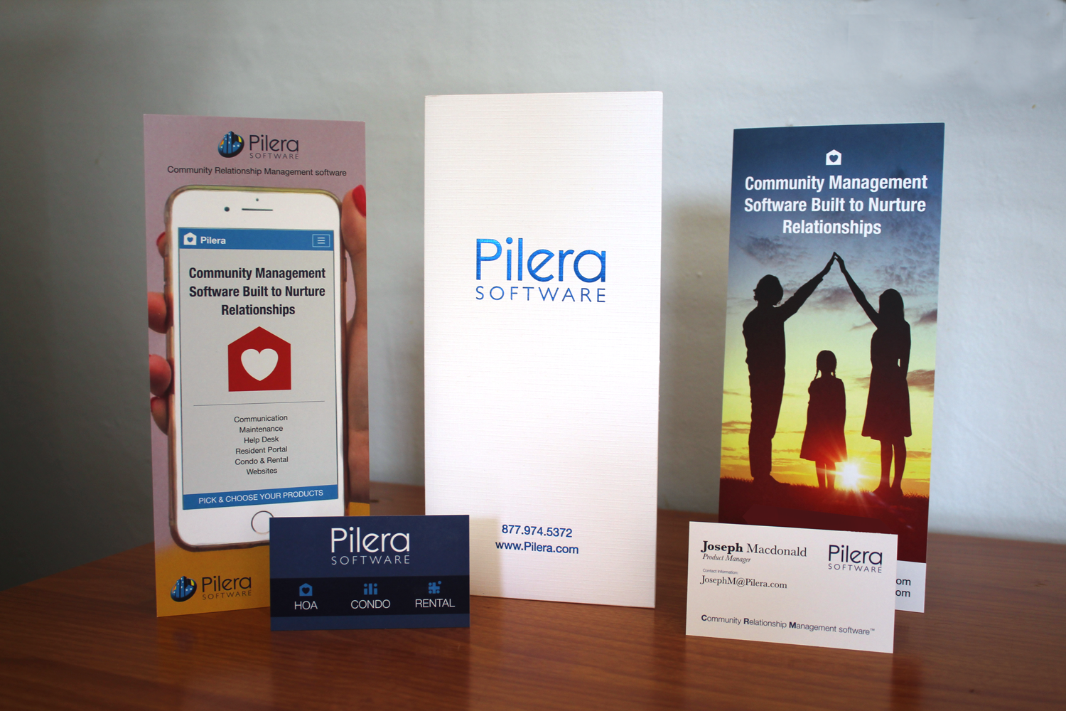
The half folders displayed as the featured image were designed to be clean and eye-catching. They are made of high quality, textured paper with foil type displaying the company name and contact information.
Business Cards
The business cards displayed in the featured image were designed by me using the muted blues displayed elsewhere in the material. The three icons representing the three industries HOA, Condo, and Apartments were also designed by me. There is a plan to include the icons through additional material as needed.
Rack Cards
Recent feedback had shown the companies previous marketing material (8.5×11 sheets of paper in folders) was large, heavy, and too old fashioned. Rack cards when combined with the half folders was the solution. Two different rack cards were printed one that mentions the benefits the company provides and the other on the products and features.
To differentiate themselves from their competitors they have a focus on their product helping build and create relationships with the customer’s client. The house with the heart in it was originally created for the specific campaign but over time has become prominent in other material as well as the favicon for the application.

Trade Show Banners
I have done a number of banners for this client, usually updating them once or twice a year. Below you can see one of the most recent incarnations of that project. Recent updates to the software drastically improved their website designs so we wanted to promote that heavily and dedicate an entire banner just to that. Listed on the other two banners is a list of the products and features.
You may notice that we decided to use the heart in a house icon again here with a slight alteration.

Brochure
This brochure design is from a previous project but it still being used by the company at this time. It had a heavy focus on being a software meant to take small management companies into the big leagues at a price they can afford. While some of the newer material uses the companies blue this one uses the yellow.


E-Book Handout
This handout had a very tight deadline and a lot of freedom. This image used heavy photo editing, creating a mockup of a non-existant physical copy of the ebook and the background image is made up of about 5 separate images. The water, snow, lightning,

The Style
After working at the company for many years, the printed materials have gone through a number of different iterations and styles. Some things have been consistent such as the color palettes but many other things have changed.
The Conclusion
Pilera Software has been the company I have worked for across many years and over time the material has adjusted with the market. These are just a few of the more recent tradeshow and print material designed for that company.
